Something to Celebrate
Brownboots launches a fresh new website for Farmers National Bank in Ohio.

6/24/21
Good things come to those who w8!
Because we are firm believers in continuous improvement — and in response to our annual client survey — we’ve been busy finetuning our proprietary content management system (CMS). Version 1.5.8 is scheduled to release on July 7.
Here’s what our current and future clients can expect:
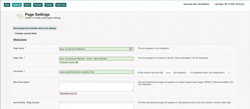
The Page Settings tab contains many fields that need to be populated when creating a new webpage or blog post — and not all are relevant for every situation. We’ve reorganized this tab to make it more obvious which fields correspond with which functions by grouping the input into sections and providing clearer descriptions and instructions for each text field, checkbox and so forth.
Moreover, when you enter the Page Name, the data for the Page Title and File Name data will automatically populate, using best practices for the syntax.
What this means for you:
Creating a new page will be quicker and more intuitive!
Improperly entered metadata in the Page Settings tab causes usability/ADA and SEO errors. To mitigate these issues, we’ve added a character counter for the Page Title and Meta Description fields, warning CMS users when they have exceeded Google’s recommended maximum length.
We also added a means to manage code in three parts of the page (head, body top and body bottom), ideal for customizing social media and Google Analytics tracking on a page-by-page basis.
What this means for you:
Managing page metadata will be at the forefront, if not foolproof!
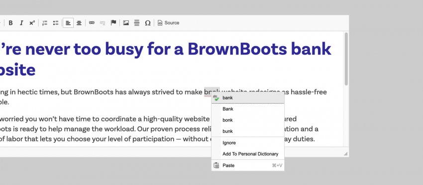
You’re probably already familiar with the squiggly red line that appears under misspelled words in programs like Microsoft Word. We’ve added something similar to the WYSIWYG editor, so you’ll see questionable spellings as soon as you enter them.
What this means for you:
Avoiding typos has never been easier!
Did you know that WYSIWYG stands for “what you see is what you get”? The notion is that you see a facsimile of the page you’re building as you create it, even before you hit the Preview button.
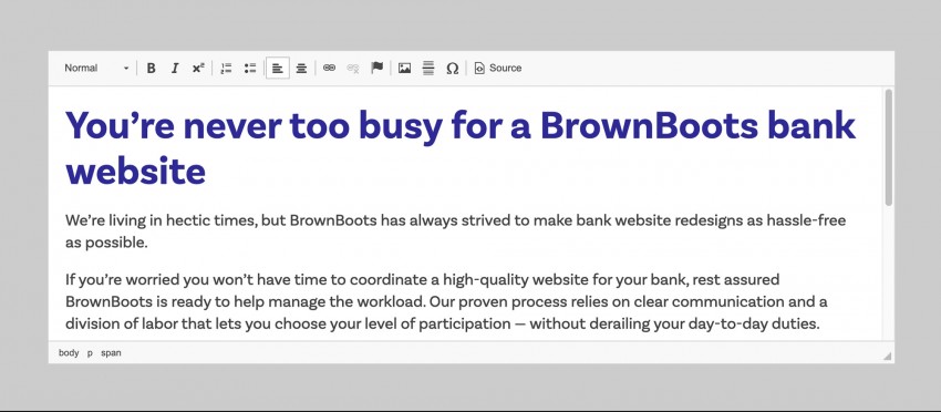
While our WYSIWYG editor always contained representative elements and drag-and-drop functionality to allow users to build custom webpages without a background in HTML programming, we’ve taken the WYSIWYG editor to the next level by importing site styles into the CMS itself. For example, the H2s in the Editor will look like H2s on the live site, bullets will be spaced accurately and other style sheet elements will inform the Editor appropriately, making the CMS more closely match the live website.
What this means for you:
What you see is truly what you’ll get!
The WYSIWYG editor is the most used element for building webpages in the CMS, so we moved it to the top of dropdown options. We also stripped it down to its essential components, streamlining the interface and removing confusing/esoteric options.
Because programs like Microsoft Word tend to bring in their own — problematic — code snippets into the resulting HTML, all text copied onto the clipboard will appear as plain text when pasted into a WYSIWYG. There’s no longer a need to click a special button to trigger this feature.
What this means for you:
The CMS’s most popular element will be more manageable than ever!
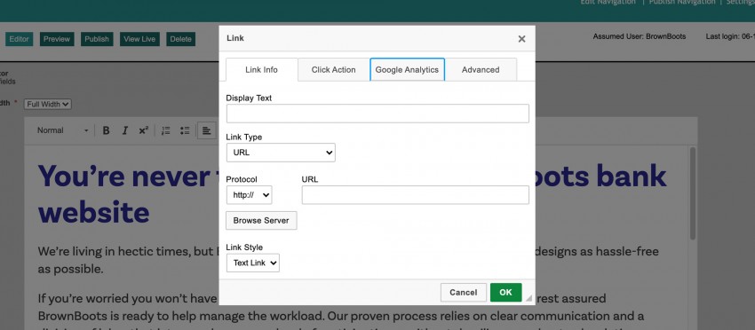
In tandem with simplifying the WYSIWYG editor, we’ve simultaneously streamlined and augmented link management. When you add a hyperlink to the page, you’ll be able to choose between a text link and a button, and whereas adding phone numbers once required manual entry of a code-specific prefix to a URL (e.g. tel:+1888-888-8888), Phone, like Email, has become its own convenient option.
What this means for you:
Adding text links, phone links and buttons will be quick and easy!
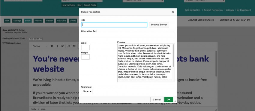
If you’re detecting a familiar theme, it’s intentional. While we’re a fan of options, too many tabs, fields and so forth can cause more problems than they solve. If nothing else, they’re cumbersome. So we streamlined how images are handled in the WYSIWYG editor and added a better way to manage alignment on the page.
What this means for you:
Managing on-page images will be speedier!
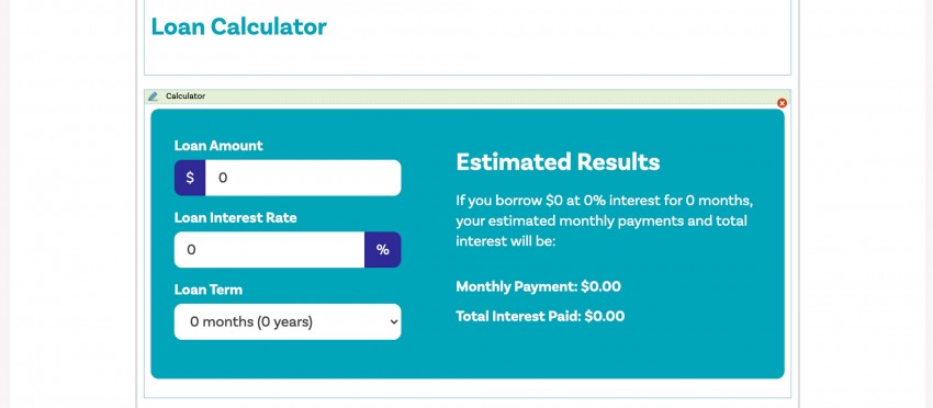
Adding the ability to insert financial calculators onto any page in the CMS was a big step forward back in the day. In the spirit of making the Editor look and feel more like the live webpage, we took the next step by displaying the selected calculator, rather than a placeholder box generically labeled “Calculator.”
What this means for you:
Editing pages and envisioning what they’ll look like live will be easier than ever!
Change is gr8! But there’s even more to get excited about ahead. The following features are also in the works for a future rollout:
What this means for you:
Our clients won’t have to do anything to trigger these improvements. The 1.5.8 update will happen automatically and not impact published webpages from a visitor’s perspective. We’ll provide more information via email in advance of the update.
In short, waiting is the hardest part!
Brownboots launches a fresh new website for Farmers National Bank in Ohio.
A new website for The Dolores State Bank showcases their updated branding and their community.
Capitol Bank of Wisconsin and Security National Bank of Nebraska are both new additions to the ever-growing BrownBoots roster of clients.