
Something to Celebrate
Brownboots launches a fresh new website for Farmers National Bank in Ohio.
4/19/23
We’ve never had a bank ask us to make a boring website.
On the contrary, clients come to us for custom designs that stand out from cookie-cutter sites. We take that responsibility seriously, which is why we scour the internet for emerging trends rooted in best practices — innovations that put visitors first and foremost.
Over the past couple of years, our clients have been asking us to make their bank websites more and more “interactive.” While that request can be interpreted in a number of ways, we know that visitors expect websites to be increasingly helpful. We see interactivity as a spectrum. Not every site needs every feature; when in doubt, always cater to the customer.
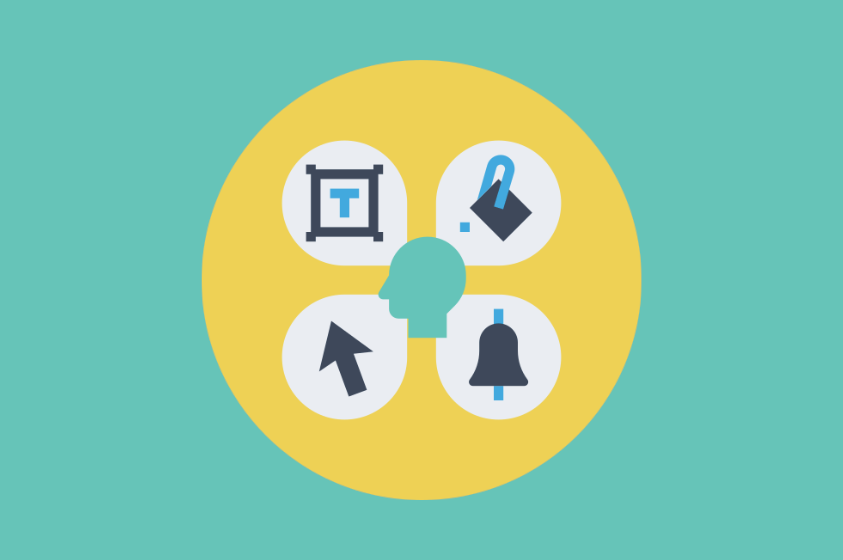
Interactivity, usability, accessibility — these interrelated concepts require something of a balancing act. Too little consideration, and you could end up with a weak website. Yet going overboard with needlessly flashy features can cause problems too.
Here are several examples of when “whiz-bang” gets in the way of amazing website design:
An image is already worth a thousand words, so there’s no need insert text into your homepage sliders, calls-to-actions (CTAs) or other promotions.
Quips aside, embedding headlines and other copywriting in image files triggers a variety of accessibility issues. At best, when these images scale down to mobile devices, the text can become too small for many visitors to read. What’s worse, screen readers can’t access this text, depending wholly on alt-text metadata, which means visitors with visual impairments will be deprived of the displayed content.
It’s all too easy to repurpose the designs from print marketing materials, but it’s always better to rebuild these promotions for use on your website: use the graphics and then HTML code (or, better yet, a content management system) to insert the text in a way that your entire audience can enjoy.
Sometimes “interactivity” seems to be synonymous with added motion or animation. Parallax scrolling and subtle, hover-over effects are fine examples of small ways that make navigating a website more visually interesting.
But a little goes a long way. When flip cards — elements with an image on one side and text on the other — or other design components require users to move a mouse to reveal the pertinent information, it robs visitors who can’t use a traditional mouse of the opportunity to consume the content. An entire section of a webpage can be rendered useless for some visitors, thanks to these laboriously hands-on features.
When considering elements that hide information, make sure activating them is universally possible, or your website won’t be ADA compliant.
Luckily, accordions are accessible. These expand-and-collapse elements compress compartments of content — typically text — so that pages don’t appear intimidatingly long at first glance. When used correctly, accordions help visitors quickly scan a page’s subject matter and then choose to dig deeper if they are inclined. Frequently asked questions, additional product details, and related services are all fine candidates for accordions.
But there are times when website admins saturate a page with too many accordions, even tucking all text in a series of expandable boxes. The good news is that screen readers can access the words, but the bad news is that all your other visitors won’t necessarily want to click repeatedly to get to the meat of the topic.
Optional or otherwise supplemental content belongs in accordions, but don’t ask your visitors to expand until they collapse!
As mentioned above, click events and hover-over effects can add flavor to a bank website’s design. Mousing over a CTA might cause an icon, an image, or the entire box to change color or increase in size slightly. Clicking a text link with an arrow beside it can indicate to the visitor that they will exit the site and see the expected content in a new browser tab.
Variety is the spice of life; however, when it comes to usability, the same actions should always bring about consistent results. If hovering over a CTA image makes it grow on one page, don’t have a similar CTA start spinning instead. Likewise, if a certain element always links to a different page on the website, avoid disparate outcomes — such as downloading a PDF — in other circumstances.
To put it simply, predictability is a virtue.
A visitor should never reach the end of a webpage and think, “Now what am I supposed to do?” That’s the purpose of calls to action. Are you interested in this product or service? Apply online, contact us by phone, visit your local branch — all of these are appropriate CTAs.
Some pages might have multiple CTAs. A personal checking page could (and should) contain details about how to open an account. It might also include an external link to order more checks and/or a callout for overdraft protection. Both of these are directly related to the page’s subject and are, therefore, appropriate CTAs.
It can be tempting to insert additional promotions, such as unrelated offers or services that the bank (though not necessarily the user) considers important. Revealing information that is disconnected from the webpage’s specific purpose leads to confusion. Worse, overwhelming the visitor could prevent clicking on any CTA, including the primary one.
Here’s the bottom line for bank website usability and accessibility: bells and whistles have their place, but whiz-bang features should never interfere, distract or confound visitors. Fortunately, there is a lot of latitude between a dull design and one that’s too demanding or even detrimental.
Brownboots launches a fresh new website for Farmers National Bank in Ohio.
A new website for The Dolores State Bank showcases their updated branding and their community.
Capitol Bank of Wisconsin and Security National Bank of Nebraska are both new additions to the ever-growing BrownBoots roster of clients.

