
Something to Celebrate
Brownboots launches a fresh new website for Farmers National Bank in Ohio.
7/26/21
Sometimes new clients come to us because their current bank website is, well, a big mess. But Peshtigo National Bank (PNB) proactively prevented their site from reaching that point.
In a prior blog post, we outlined 6 reasons why it’s time for a bank website redesign. Here’s how the old PNB website measured up:
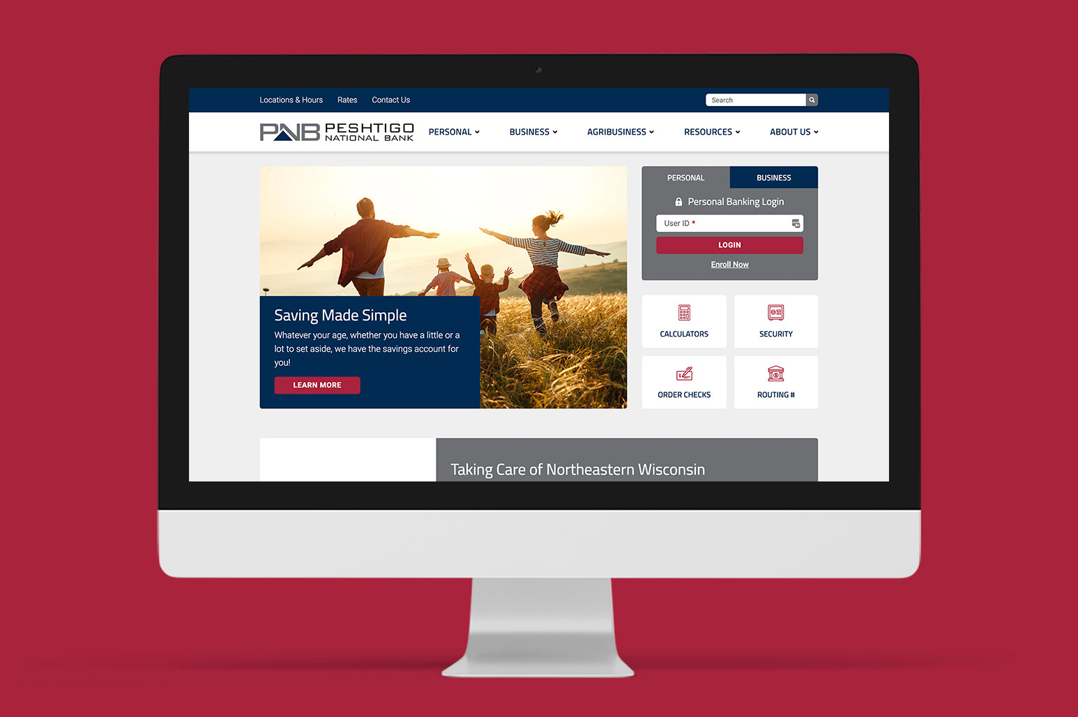
For the most part, pnbwi.com was already a mobile-friendly website when we got our hands on it. Although nothing was technically broken, there was plenty of room for improvement, including ensuring the online banking login appears on every page — even when displayed on a mobile device. We also added contemporary elements, such as expand/collapse accordions and custom call-to-action prompts, to keep the look and feel current.
“Eyesore” is too strong a word in this case. “Outdated” might be a better term. Stacks of block text and elements like a side column containing a small image with rounded corners suggested an aging aesthetic. Of course, every BrownBoots bank website redesign pumps the visuals with renewed vivacity. Furthermore, the new site features the smiling faces of PNB’s staff, adding much-needed personality.
As mentioned above, the prior site’s basic design didn’t allow for much customization. Given time, the web admins would have had to get “creative” to accomplish what they wanted, bastardizing the design to do what they needed. Fortunately, our robust, easy-to-use content management system (CMS) provides an almost futureproof approach to flexibility.
While the information on the old PNB website was up to date, additional content — such as individual pages for branches — rounded out the sitemap. A bigger concern was how paragraph-heavy the previous site was, which is why we streamlined the text and organized it so that webpages would be more scannable.
The old PNB website was the first iteration of the bank’s main online marketing tool after a rebrand. BrownBoots took the redesign as an opportunity to ensure all facets of the website — from visuals to messaging to priorities — are properly aligned.
Acquisition or merger was not a factor in deciding to design the website. With 120 years of service under Peshtigo National Bank’s belt and a legacy of serving Northeastern Wisconsin’s families, ag operations and other businesses, PNB prides itself on being locally owned. The new website was intentionally designed to transform how customers interact with their bank online.
No one can debate the fact that the bank’s new website is far more modern, engaging and effective than its predecessor!
Brownboots launches a fresh new website for Farmers National Bank in Ohio.
A new website for The Dolores State Bank showcases their updated branding and their community.
Capitol Bank of Wisconsin and Security National Bank of Nebraska are both new additions to the ever-growing BrownBoots roster of clients.

