
Something to Celebrate
Brownboots launches a fresh new website for Farmers National Bank in Ohio.
9/22/21
A healthy bank website has only as much content as will be used by visitors — no more, no less.
We often find ourselves carving away the fat when it comes to bank website redesigns. We remove or redesign underused features and streamline existing content, such as combining shallow pages or stripping away outdated information altogether.
Of course, the other extreme is equally problematic.
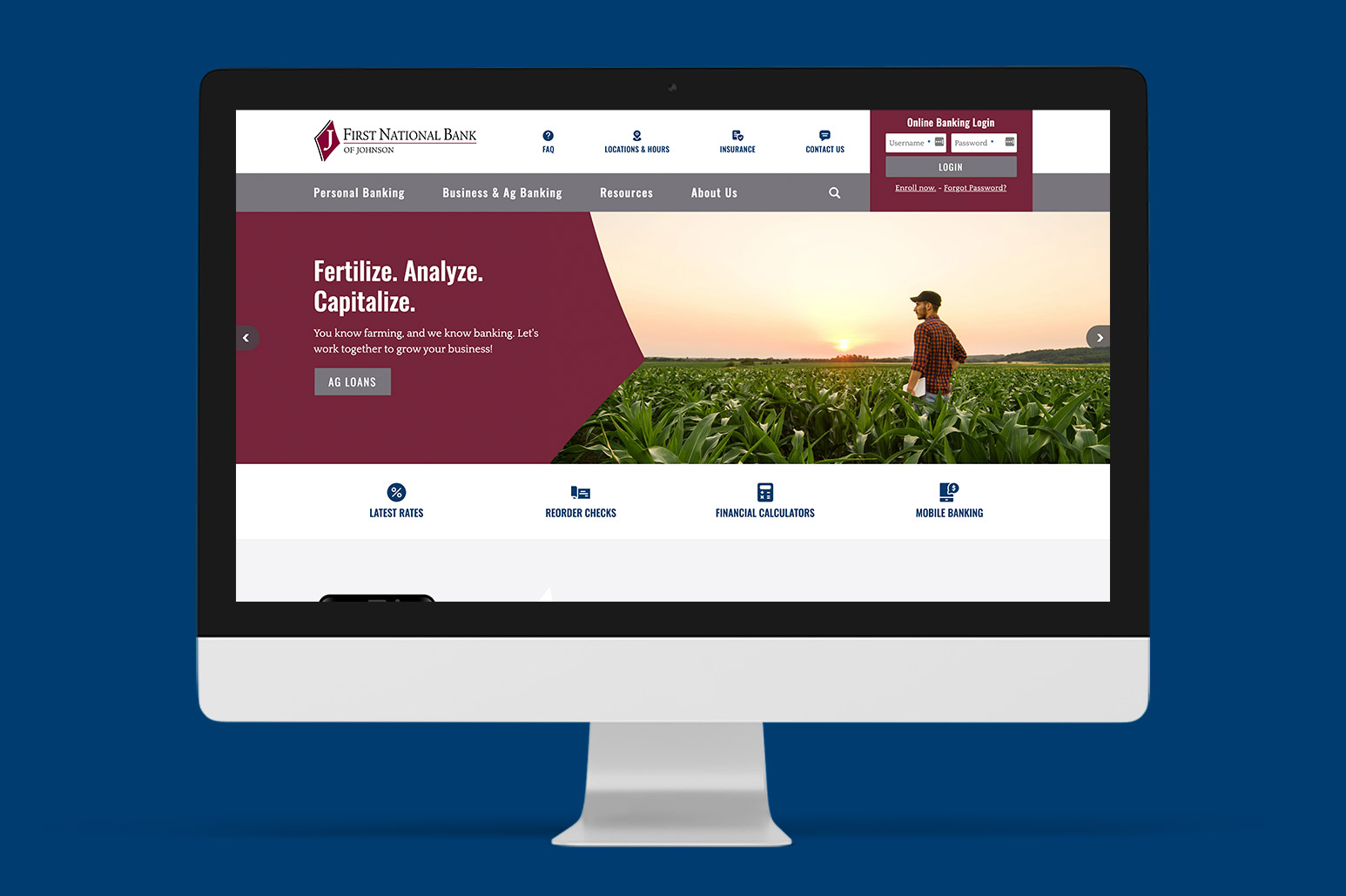
First National Bank of Johnson’s old website was emaciated. The too-small site lacked key pages that customers have come to expect from bank websites, including destinations dedicated to current rates, reordering checks, and the bank’s routing number. We also beefed up product and services pages with missing information and clear calls to action.
Finally, we injected a healthy dose of ADA compliance to make the bank website as user-friendly for as many visitors as possible.
To complement the trim treatment of content, we dressed the website in flattering aesthetics that make finding the online-banking login and mobile-app download badges easy. Images highlighting America’s heartland convey the financial’s dedication to serving families and agribusinesses, while prominent patriotic visuals reflect that FNB is, in fact, a national bank.
We love how intentional and trim the new website turned out, and we love that the client loves it. Best of all, First National Bank of Johnson’s customers can now quickly find the information and tools they need — no more, no less.
Brownboots launches a fresh new website for Farmers National Bank in Ohio.
A new website for The Dolores State Bank showcases their updated branding and their community.
Capitol Bank of Wisconsin and Security National Bank of Nebraska are both new additions to the ever-growing BrownBoots roster of clients.

