
Something to Celebrate
Brownboots launches a fresh new website for Farmers National Bank in Ohio.
6/13/18
A website is only as strong as its weakest page.
We like to think of websites as living, breathing things. They usually start out as fine, fit specimens, but as the weeks, months and years go by, content and structure change. New pages pop up. Without the proper care, websites get out of shape.
When it comes to a website review, we recommend a page-by-page checkup.
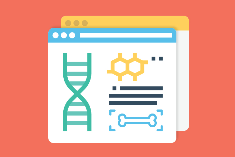
Let’s start with an X-ray. Supporting a webpage like a skeleton is a somewhat unseen set of information called meta data.
Although the term covers a lot of territory, the most pertinent examples include page titles, meta descriptions and alt text for images.
Every webpage needs a unique title that expresses what visitors can expect to find there. While most browsers’ tabs don’t display the full text, page titles are important because they are what appears on search engine results pages (SERPs).
For strong page titles:
Like page titles, meta descriptions appear most often on SERPs. They build upon the page title, giving visitors a snapshot of the webpage’s purpose. It’s an easy piece to overlook, but if it’s broken — or, worse, missing altogether — the entire page suffers.
For sturdy meta descriptions:
Simply put, alt text is a description of every photo, illustration and graphic on a webpage. Most visitors will never see alt text, yet this attribute is incredibly important — not only because ADA compliance demands it, but also because visitors who depend on screen readers to comprehend content need alt text to interpret what they cannot see.
For well-fortified alt text:
It’s not brain surgery, but it takes some effort to get into the minds of your visitors. Because the webpage might not have the information the visitor is looking for, he or she needs to be able to get around. Navigation to the rescue!
Search boxes and sitemaps can help, but it’s even better to give a visitor a clear view of where they are in relation to other pages and a path to related content. Common examples of navigation include:
Remember, not every visitor arrives via the homepage. While specialty landing pages might feature streamlined navigation, you will always want to give your visitor access to multiple pathways presented in a smart and logical manner.
Of course, the meat of any webpage is the content. Here are a handful of tips to keep your content in peak physical condition:
Words usually make up the majority of a webpage’s content. Text should be salient, but even if you trim the marketing fat and give visitors exactly what they’re looking for, steps should be taken to make reading — or scanning — easier.
Every webpage should include only what is necessary. What happens if there happens to be a ton of important content? Visitors aren’t afraid to scroll, and yet an extremely long webpage can be cumbersome to navigate.
While it can be tempting to repurpose existing files on your website, linking to copious PDFs is a weak move. Why?
This doesn’t mean PDFs should be eschewed entirely. It’s OK to occasionally link to longer publications or legal-centric documents like policies and disclosures. As a general rule, however, unless there’s a compelling reason not to, port PDF content over to a webpage.
A healthy webpage is more than a repository of information. You want to capitalize on a visitor’s curiosity and interest. You want conversions, which means you want them to do…something.
That’s where a call to action (CTA) comes in. CTAs, the lifeblood of any webpage, are prompts that encourage visitors to take some specified step. Here are a few examples of CTAs:
If a visitor gets to the end of a webpage and there isn’t a clear next step, you’re leaving a lot up to chance. Webpages with a healthy pulse have at least one CTA, though you certainly can have more. Just be sure not to overwhelm the reader: sprinkle them throughout the page where appropriate.
And you simply can’t go wrong with a strong link at the end of the content.
Make your webpages thrive with a bank website design from BrownBoots.
Brownboots launches a fresh new website for Farmers National Bank in Ohio.
A new website for The Dolores State Bank showcases their updated branding and their community.
Capitol Bank of Wisconsin and Security National Bank of Nebraska are both new additions to the ever-growing BrownBoots roster of clients.

