
Brand New Branding
Twenty-seven years ago, we named this company after a pair of work boots. They stood for how we wanted to show up every day: sleeves rolled up, boots laced, ready to get to work.
A lot has changed since November 1999. We've grown, we've evolved, and we found our calling: helping community banks and credit unions keep their websites simple and quick to manage, so their teams can spend more time with the communities they serve. Today we're proud to partner with about 60 financial institutions across the country.
What hasn't changed is the mindset behind the name. So for our 27th birthday (we like celebrating the odd ones), we're putting it back up front with a brand refresh.
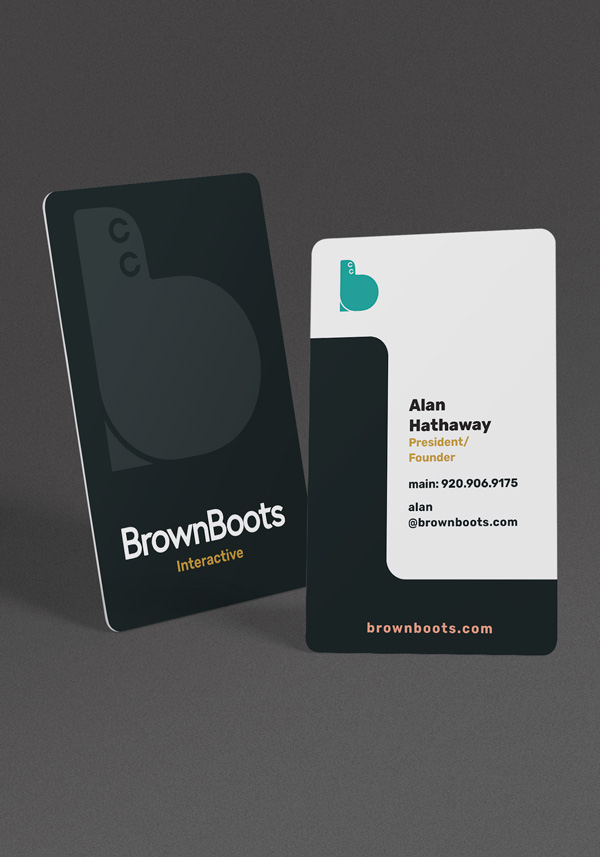
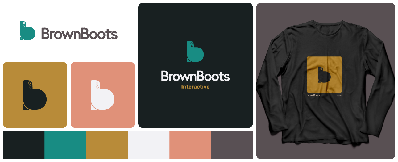
Staying true to what makes BrownBoots special, the redesign returns to a warm color palette that feels comfortable. It's a little retro, and that's on purpose: a nod to where we started and a promise about how we'll keep working. The team you know, the way we work with you, and our commitment to having your best interests in mind isn't going anywhere.
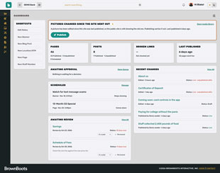
In addition to a new logo and website, we're also introducing a brand new content management system, the most capable tool we've ever put in our clients' hands. It does more of the heavy lifting, it's easier to use, and it fits right in the tool belt.